Showing posts with label Research and Planning. Show all posts
Showing posts with label Research and Planning. Show all posts
Wednesday, 27 November 2013
Location Change
Unfortunately I had to change location from the school main stage to the drama department. The reasoning behind this was that i wanted to keep continuity in my video and I was unable to film on the main stage when I needed to. The drama room is free and was easy to set up in as it is easier to access. Another reason for my change is that the lighting was better in drama as I could use the spotlights in the ceiling as well as the free standing lights, which removed almost all shadow. As well as this it made the band bright whilst keeping the background dark following the conventions of my genre. Where as on the main stage, I was unable to use the lights as it was only available if used by a professional.
Monday, 18 November 2013

Thursday, 7 November 2013


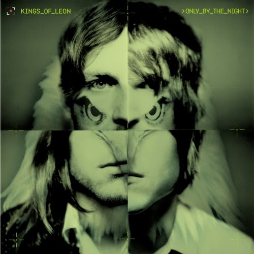
Thought behind 'FUN BAND'
I wanted to portray a fun band that aren’t so serious and
can have fun as well as perform. I feel that as well as the front cover
following conventions of other bands, by having a 4 quadrant picture, it also
makes the band look fun. This is backed up and emphasized by the panel under
the CD which shows a fun picture of the band.
Evidence Behind Small Lyrics on inside of Digipack
The reasoning behind me putting the lyrics so small on the inside cover of the digipack is that it follows conventions of other bands such as the 2 examples which I have photographed, The Beasty Boys and The Avalanches. I feel this looks good and adds to the overall effect of my digipack.


Wednesday, 6 November 2013
Examples of Black and White CD Covers


My Cd cover follows similar conventions to the above covers as the images are black and white and have a small element of colour for the band name/ album name!
Other examples of bands with black and white covers:


Friday, 1 November 2013
Reasoning behind my magazine advert!
I wanted to keep the black and white theme running through my work. I feel
that it works well as the digipack is predominantly black and white. As well as
this I wanted to use the same text on the magazine advert as the digipack, as well
as keeping the same colour palette; black white and red. I decided to use a
minimalistic style and not over complicate the design of the magazine advert.
The page clearly promotes both the band and its new album as well as the record
company.
Wednesday, 30 October 2013
Change of Band Name - Pocket System
After consultation with the teacher, we have decided to change the name of the band. The reasoning behind this was that the name sounded too flowery. The name reminded us too much of Evanescence and Paramore.
We looked at many possible names:
Neon Hearts
False Magic
New Haze
Neon Haze
Gold Diamonds
Little Walls
Psychic Plan
Monochrome Mountains
Loan Runner
Skyline Massacre
Altered Plan
Young Furs
Small Islands
Animal Set
The Set
Modest Turks
Secret Mountains
Small Cassettes
Young Mission
I then Decided to try the 4 i liked the most which were:
Asphault Massacre
Neon Haze
Pocket System
Altered Skyline
I changed the magazine advert to the new names to see which would look best and which name fit the band most. We decided that Asphault Massacre sounded to like a heavy metal band, Neon Haze sounded like a disco band and Altered Skyline didnt fit the image of the band. This helped me to make the decition to change my band name to Pocket Skstem.
Monday, 28 October 2013


Thursday, 17 October 2013


Wednesday, 16 October 2013

Comparisons - The Front Cover

From the examples below you can see that my cover follows closely the conventions of the genre.


Monday, 7 October 2013
Ideas for Digipack cover (4)

The idea of this is relatively simple, easily achiveable and looks good. The cover only has the band name on and no album name, which many bands in this genre do such as Kasabian. An example of another band which have used this style is Weezer.

Ideas for Digipack cover (3)

 Some rock bands like the above, Greenday and Blur, decide to have graffiti as or on their album cover. This would be a good idea as graffiti is everywhere on the streets and is easy to photograph. This would work well as other bands of a similar genre to my band use this idea and it looks good.
Ideas for Digipack cover (2)
I like the style that Andy Warhol used in his paintings, The idea of a 4 quadrant picture looks good. If i were to chose this idea it would be all 4 of my band members on the cover as oppose to just the lead singer.


As you can see from the back cover of my digipack (bottom left) I experimented with the idea, but found little evidence of this conforming with the genre apart from The Kings of Leon
Subscribe to:
Posts (Atom)